Tutorial
EDA - Exploratory Data Analysis: Using Python Functions

While we believe that this content benefits our community, we have not yet thoroughly reviewed it. If you have any suggestions for improvements, please let us know by clicking the “report an issue“ button at the bottom of the tutorial.
In the previous articles, we have seen how to perform EDA using graphical methods. In this article, we will be focusing on Python functions used for Exploratory Data Analysis in Python. As we all know, how important EDA is it provides a brief understanding of the data. So, without wasting much time, let’s roll!
Exploratory Data Analysis - EDA
- EDA is applied to investigate the data and summarize the key insights.
- It will give you the basic understanding of your data, it’s distribution, null values and much more.
- You can either explore data using graphs or through some python functions.
- There will be two type of analysis. Univariate and Bivariate. In the univariate, you will be analyzing a single attribute. But in the bivariate, you will be analyzing an attribute with the target attribute.
- In the non-graphical approach, you will be using functions such as shape, summary, describe, isnull, info, datatypes and more.
- In the graphical approach, you will be using plots such as scatter, box, bar, density and correlation plots.
Load the Data
Well, first things first. We will load the titanic dataset into python to perform EDA.
#Load the required libraries
import pandas as pd
import numpy as np
import seaborn as sns

#Load the data
df = pd.read_csv('titanic.csv')


#View the data
df.head()
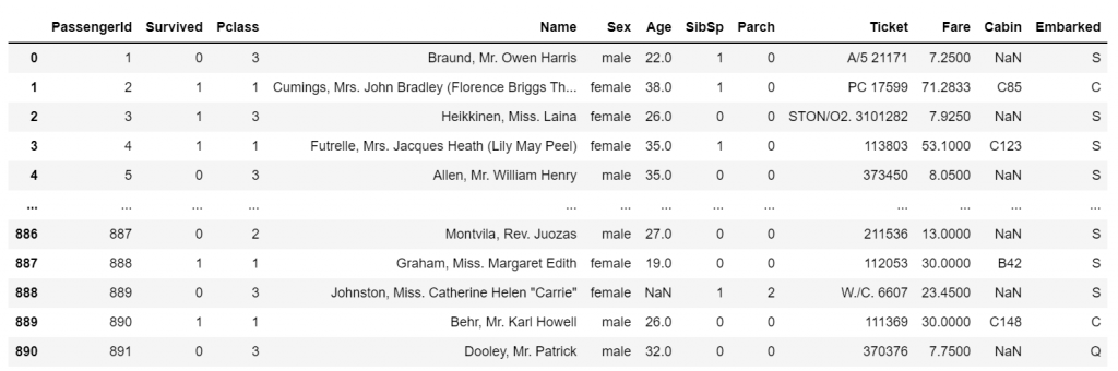
Our data is ready to be explored!
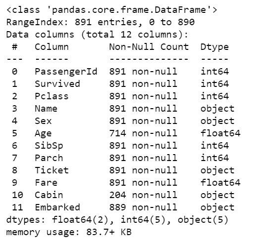
1. Basic information about data - EDA
The df.info() function will give us the basic information about the dataset. For any data, it is good to start by knowing its information. Let’s see how it works with our data.
#Basic information

df.info()

#Describe the data

df.describe()
- Describe the data - Descriptive statistics.
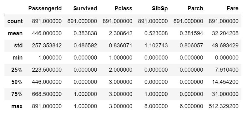
Using this function, you can see the number of null values, datatypes, and memory usage as shown in the above outputs along with descriptive statistics.
2. Duplicate values
You can use the df.duplicate.sum() function to the sum of duplicate value present if any. It will show the number of duplicate values if they are present in the data.
#Find the duplicates

df.duplicated().sum()
0
Well, the function returned ‘0’. This means, there is not a single duplicate value present in our dataset and it is a very good thing to know.
3. Unique values in the data
You can find the number of unique values in the particular column using unique() function in python.
#unique values

df['Pclass'].unique()

df['Survived'].unique()

df['Sex'].unique()
array([3, 1, 2], dtype=int64)


array([0, 1], dtype=int64)


array(['male', 'female'], dtype=object)
The unique() function has returned the unique values which are present in the data and it is pretty much cool!
4. Visualize the Unique counts
Yes, you can visualize the unique values present in the data. For this, we will be using the seaborn library. You have to call the sns.countlot() function and specify the variable to plot the count plot.
#Plot the unique values

sns.countplot(df['Pclass']).unique()
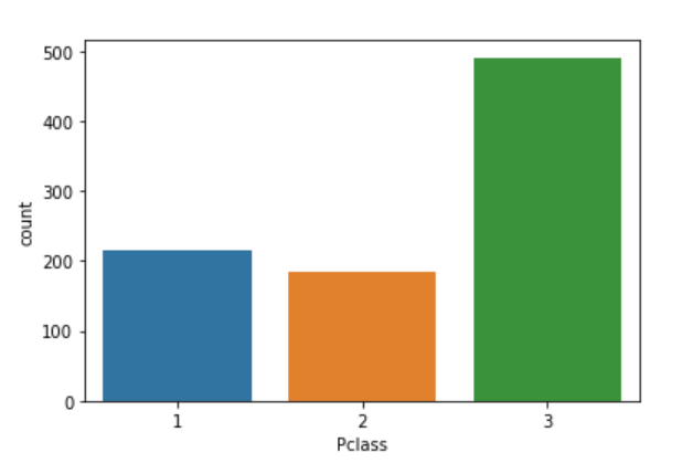
That’s great! You are doing good. It is as simple as that. Though EDA has two approaches, a blend of graphical and non-graphical will give you the bigger picture altogether.
5. Find the Null values
Finding the null values is the most important step in the EDA. As I told many a time, ensuring the quality of data is paramount. So, let’s see how we can find the null values.
#Find null values

df.isnull().sum()
PassengerId      0
Survived         0
Pclass           0
Name             0
Sex              0
Age            177
SibSp            0
Parch            0
Ticket           0
Fare             0
Cabin          687
Embarked         2

dtype: int64
Oh no, we have some null values in the ‘Age’ and ‘Cabin’ variables. But, don’t worry. We will find a way to deal with them soon.
6. Replace the Null values
Hey, we got a replace() function to replace all the null values with a specific data. It is too good!
#Replace null values

df.replace(np.nan,'0',inplace = True)

#Check the changes now
df.isnull().sum()
PassengerId    0
Survived       0
Pclass         0
Name           0
Sex            0
Age            0
SibSp          0
Parch          0
Ticket         0
Fare           0
Cabin          0
Embarked       0

dtype: int64
Whoo! That’s awesome. It is very easy to find and replace the null values in the data as shown. I have used 0 to replace null values. You can even opt for more meaningful methods such as mean or median.
7. Know the datatypes
Knowing the datatypes which you are exploring is very important and an easy process too. Let’s see how it works.
#Datatypes

df.dtypes
PassengerId      int64
Survived         int64
Pclass           int64
Name            object
Sex             object
Age             object
SibSp            int64
Parch            int64
Ticket          object
Fare           float64
Cabin           object
Embarked        object

dtype: object
That’s it. You have to use the dtypes function for this a shown and you will get the datatypes of each attribute.
8. Filter the Data
Yes, you can filter the data based on some logic.
#Filter data

df[df['Pclass']==1].head()
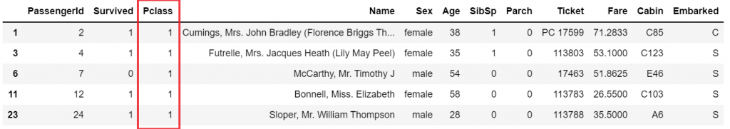
You can see that the above code has returned only data values that belong to class 1.
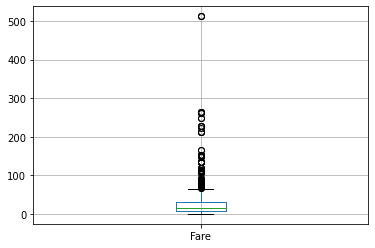
9. A quick box plot
You can create a box plot for any numerical column using a single line of code.
#Boxplot

df[['Fare']].boxplot()
10. Correlation Plot - EDA
Finally, to find the correlation among the variables, we can make use of the correlation function. This will give you a fair idea of the correlation strength between different variables.
#Correlation

df.corr()
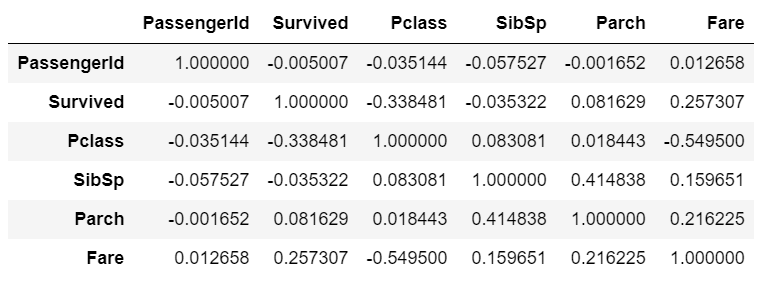
This is the correlation matrix with the range from +1 to -1 where +1 is highly and positively correlated and -1 will be highly negatively correlated.
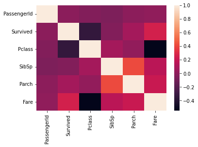
You can even visualize the correlation matrix using seaborn library as shown below.
#Correlation plot

sns.heatmap(df.corr())
Ending Note - EDA
EDA is the most important part of any analysis. You will get to know many things about your data. You will find answers to your most of the questions with EDA. I have tried to show most of the python functions used for exploring the data with visualizations. I hope you got something from this article.
That’s all for now! Happy Python :)
More read: Exploratory Data analysis
Thanks for learning with the DigitalOcean Community. Check out our offerings for compute, storage, networking, and managed databases.
author


Get our biweekly newsletter
Sign up for Infrastructure as a Newsletter.

Hollie's Hub for Good
Working on improving health and education, reducing inequality, and spurring economic growth? We'd like to help.

Become a contributor
Get paid to write technical tutorials and select a tech-focused charity to receive a matching donation.
